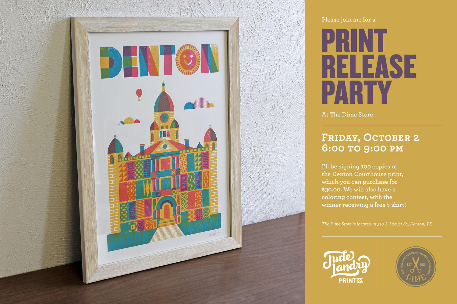
This Friday, October 2nd, I will be having a print release party at The Dime Store in Denton, Texas, to celebrate the release of my latest poster. This is a three-color, 18x24" print of the iconic Denton Courthouse. I printed 100 of these and I will be signing them at the store. I'll also have all of my other prints and shirts available for purchase.
Paul Echols of Square 205 was in my studio while I was printing the Courthouse. He put together this awesome video, so I hope you'll check it out. I'd like to thank Paul and The Dime Store for sponsoring the Project Denton video. You can also watch more Project Denton videos here. Have a look at some more images of the print after the video. Hope to see you at the party!


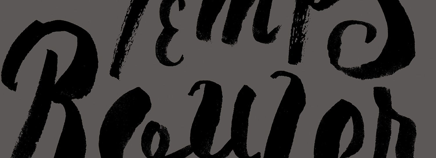
Laissez Les Bon Temps Rouler!
In case you don't speak French (and you're too lazy to use Google), "Laissez Les Bon Temps Rouler" means "Let The Good Times Roll". It's a popular saying in my home state Louisiana, especially around Mardi Gras season, that encourages people to remember to enjoy life at all times. I have wanted to create a print with this phrase for a few years, so I'm pleased to have finally gotten to it. This is the second print in my Wisdom of Words Project–a yearlong series of handcrafted typography prints. You can see the first print in the series here. I decided to use a brush script style for February's print. This lettering style is a perfect fit for the meaning of the text–that life is never perfect, but it's full of fun and energy. To create the art for this print, I used a small, pointed brush and some india ink. Rather than trying to get each letter perfect in one amazing attempt, I drew each letter individually many times and then later combined them into the final composition. This technique is surprisingly easy, given that you draw some fantastic letters. The result is a hand-drawn, energetic typographic brush style with natural textures.

I created pages and pages of letters, drawing each one until I was confident that I had a few good ones. I especially focused on getting good thick to thin contrast within the strokes. I also made an effort to work the ink until it started to run out of the brush, that way I would get some dryer strokes that were more textured.
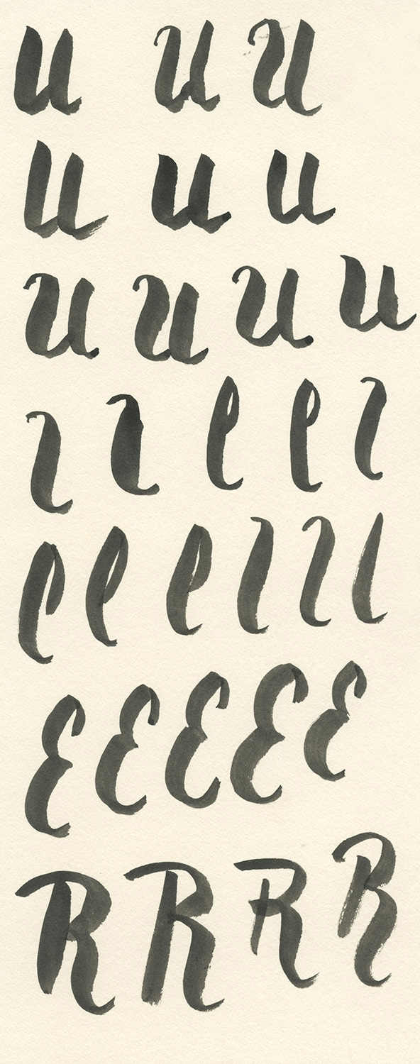

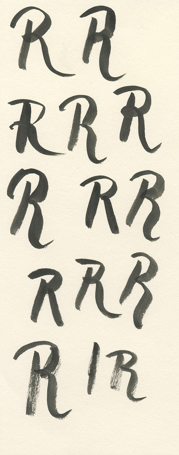
I spent about two hours drawing all of the letters. I then scanned each page at a very high resolution (1200 dpi). With the letters in a digital format, I selected the best of each one and brought it into a new document, keeping a bit of the original paper that surrounded them.

The image above is a composite showing the letters surrounded by their initial paper texture. Each letter was placed on a different layer in Photoshop and given a Multiply transparency. This method allowed me to move, resize, and rotate each letter exactly as I wanted.

After the layered image was complete, I used the Threshold adjustment to push each letter to pure black and white. I wanted to retain a bit of the original texture within each letter, while keeping the letters heavy and black. The final screen print will use silver and black ink on a red paper. I'll post images of the printing after I get that finished.
2015 - I don't have a resolution, I have a project.
I won't use an exclamation point at the end of this sentence, but let me assure you, I am really excited about the upcoming year. After moving to Denton, Texas in July of 2014, I spent the fall adjusting to a new job, new city, & new friends. My strategy was to ease into all of this like a timid swimmer into a cold pool. Well, that time of ease is over my friends, and I'm ready to get back to work. I have been assembling a new screen printing studio, and I want to break it in with a buttload of new prints. That's why for 2015, I don't have a resolution; I have a project.
12 Months
12 Papers
12 Prints
It's a simple idea: create one hand-lettered print each month for a year. I have always envied artists and designers who are able to create a series of similar pieces. My ideas for self-authored prints tend to be a bit all over the place. I enjoy type and illustration equally, and I want to excel at both. As soon as I finish creating something with letters, I want to get away from that and draw pictures instead. I'm also interested in a lot of different methods of production, so I've never tried too hard to develop a recognizable style. This way of working keeps things fresh, but it can also make a schizophrenic portfolio.
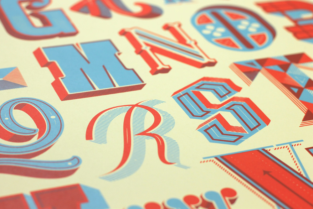
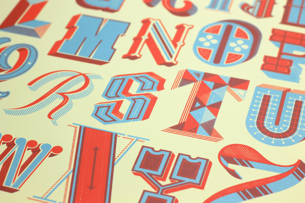
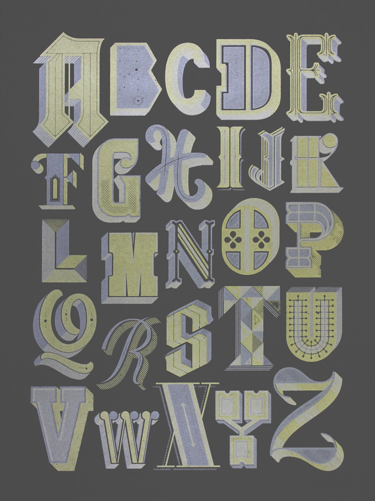
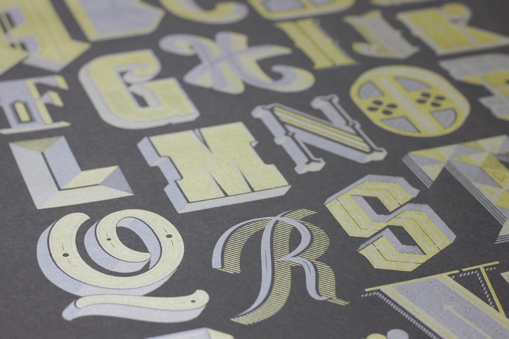
Last year, I completed a decorative alphabet. Each letter was its own little piece of art, but together they form a whole body; something greater than the sum of its parts. I like to think that last year's alphabet project was the perfect precursor to this year's project.
There is a well known formula for creating a successful body of work: keep some things the same, let other parts vary. For this series of prints, I plan on using the same two colors of ink (one thing the same), and a different color of paper for each print (one thing different). Each print will be the same size (same), and will feature a short quote or phrase (different). I have already collected most of the phrases that I want to illustrate. Other things that will vary are the styles of lettering and the tools of production. I want to use pencils, pens, brushes, cut paper, collage, and the computer. Right now, this series of prints is just a cloudy idea in my head. I can't see any of it clearly, but I have a sense that it will be really fun.
I will be sharing a lot of the work involved, which should involve images of drawings and of the printing process. I also realize I'm already a little behind on getting started, but that's ok. I don't need to stick to an exact schedule. I reserve the right to change direction, or quit altogether. Maybe at the end of this, I'll be disappointed with the results. Whatever the outcome, I'm happy to have a plan. I hope you'll follow along during this year-long project.

Renegade Craft Fair Austin
I am thrilled to be participating in my first Renegade Craft Fair this year in Austin, Texas. Join me and over 100 other indie makers at the Palmer Events Center from 11 am – 6 pm on Saturday, November 29 and Sunday, November 30. Hope to see you there!
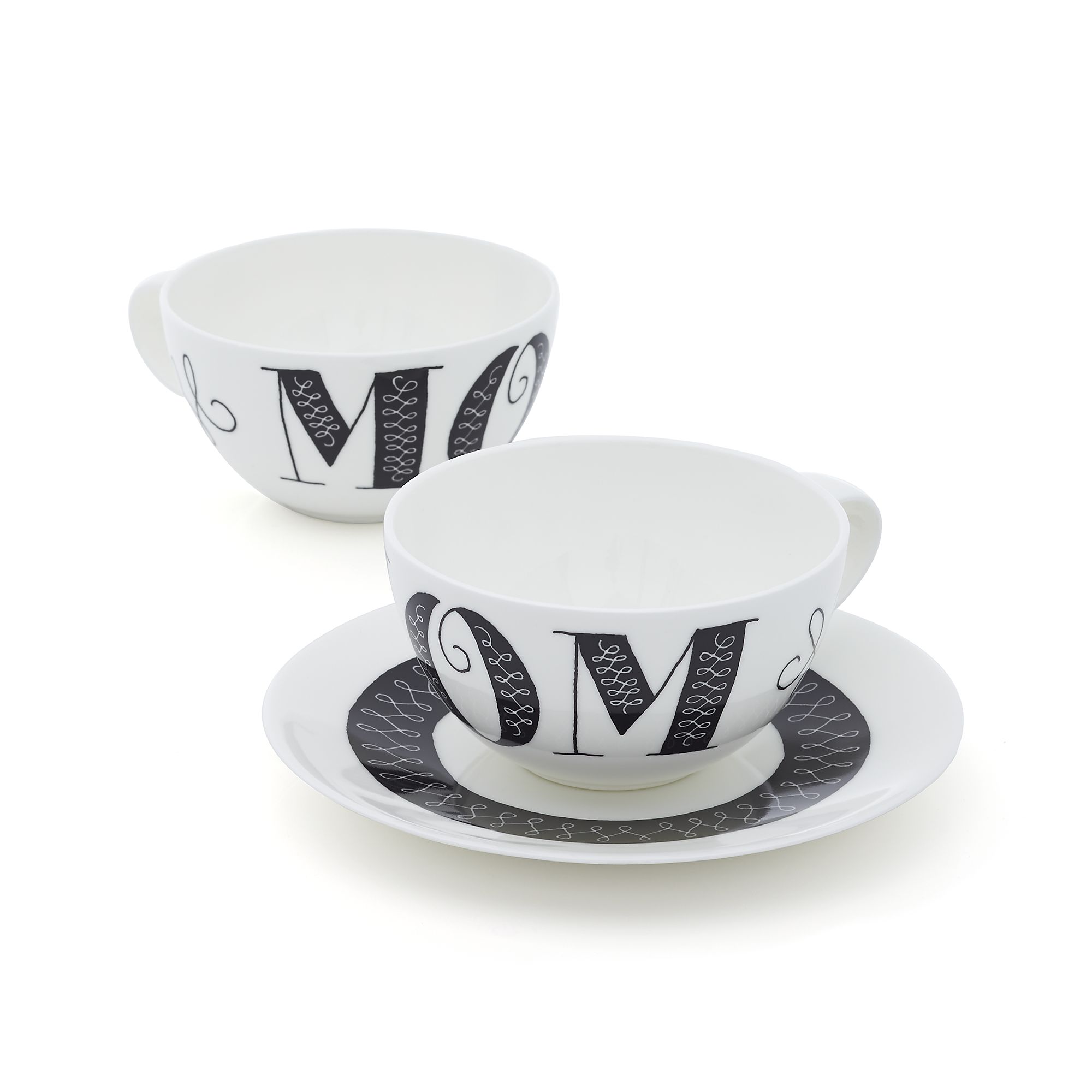
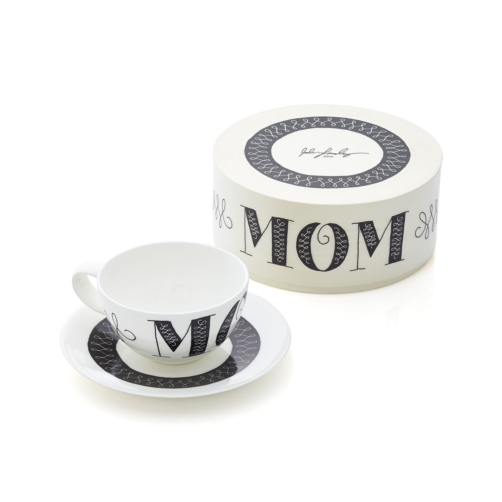
Crate & Barrel Mother's Day Teacup Process
Recently I had the privilege of working with Bonnie Cauble from Crate & Barrel on a Mother's Day teacup. It was a really fun project and I want to share some of the drawings behind the final artwork. I began working on this on July 25, 2013, knowing that it would be released for Mother's Day, 2014. The teacup is part of a series of limited edition Mother's Day cups by various artists. I had a few days to do the whole thing, from start to finish. Luckily it was a pretty straightforward project. Bonnie's only direction for me was "It has to say Mom!" No art director has ever give simpler instructions. She sent me a template for the cup and saucer, and I started with some sketching. We agreed to work on the cup first, and once the direction was chosen, I would work on the saucer. Here are the initial drawings for the cup:
Sketch #1
Sketch #2
Sketch #3
As you can see, we didn't have time to do 50 drawings. We were working quickly and there wasn't much conceptual work to be done. Mainly, I wanted the typography to be strong and feminine, something that would appeal to mothers. After looking at the first limited round of sketches, Bonnie thought that Sketch #2 was the best direction for the teacup. She wanted to remove the large spaces between the letters M-O-M so that the word MOM could be read all at once on one side of the cup. Here is the revised drawing following the changes:
Revised artwork drawn on a light table with a Micron Pen.
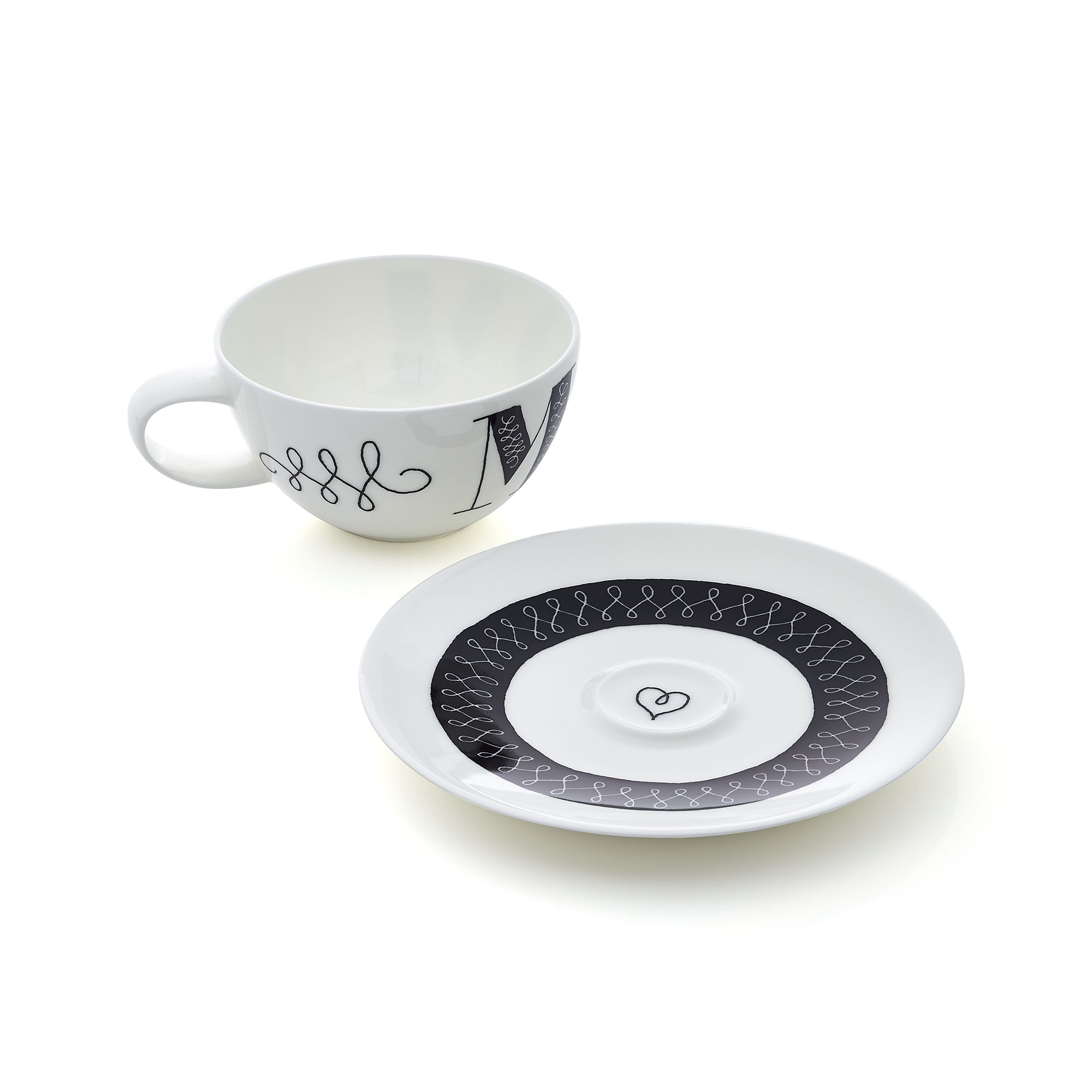
Following the style of the lines on the cup, I set about creating the artwork for the saucer. The little heart in the middle is meant to offer a pleasant surprise after the cup is lifted.
Original Scan of the saucer artwork.
I knew I wanted the final artwork to retain a hand-drawn style, so I never planned on creating sharp-edged type and lines. Instead, I scanned the pen drawings at a very high resolution and then used livetrace in Adobe Illustrator. The artwork had to be in a vector format according to the specifications. I presented three variations of the final artwork, which you can see below.
Final Option #1: Retain pen outlines in black.
Final Option #2: Reverse pen artwork to fill in the letters with black.
Final Option #3: I added a light blue/green as a two-color option.
Bonnie decided she liked option #2 the best, so that ended up being the final artwork. I passed along the digital files and the good people at Crate&Barrel handled the production. I don't usually work on these types of projects, and waiting 8 months just to see the final product was unusual. I am very pleased with the final result. One surprise that I didn't know about was the packaging. The cup is packaged in a round wooden box, similar to a small hat box. Below you can see images of the final cup along with the entire series.
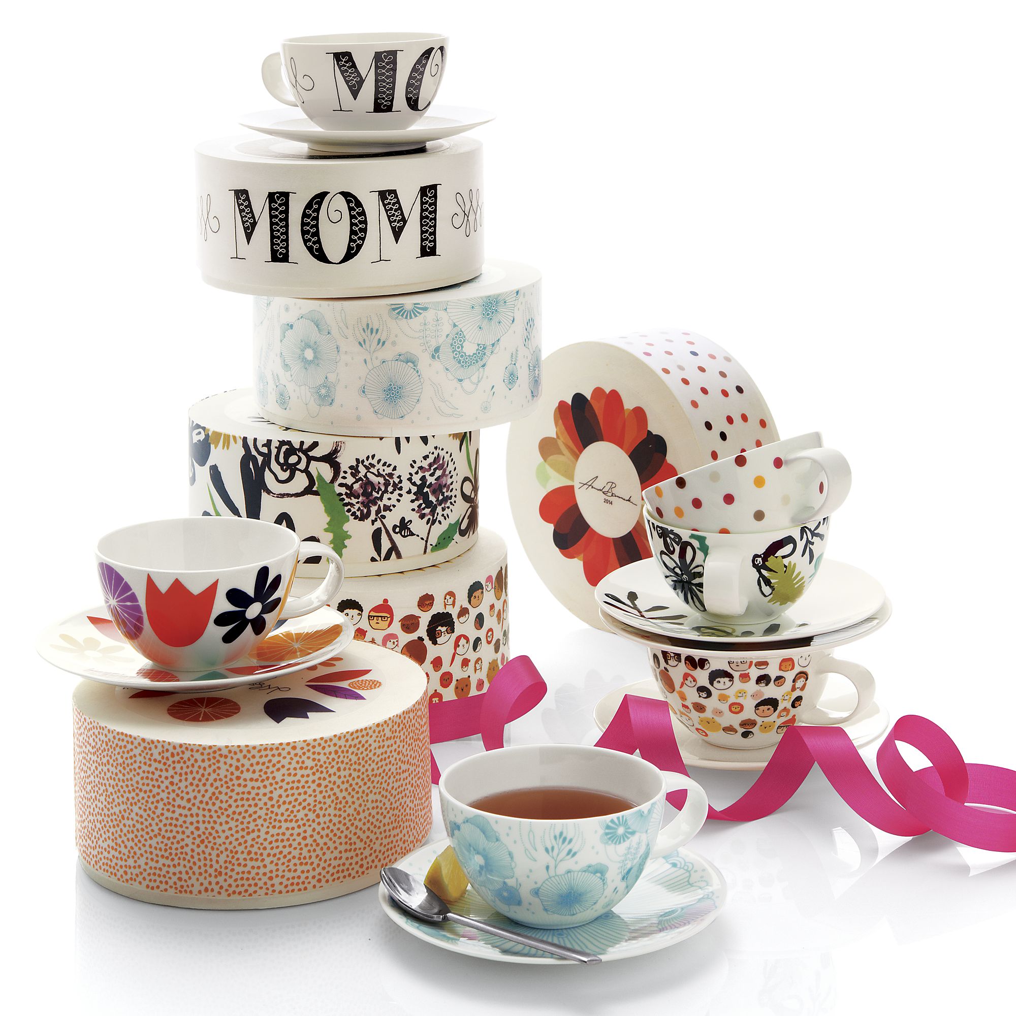
I'd like to offer a special thanks to the three most important mothers in my life. My beautiful wife Alisha, my own mother Cindy, and my mother-in-law Linda. Thank you for all that you have each done for me! If you would like to purchase one of the teacups, head over to Crate&Barrel.
Working Stroked Vectors Into The Grid
Quick, what’s 9 times 8? Hopefully you thought 72, but if you’re a designer, you may have instinctively shouted “I HATE MATH!” Most of the designers and design students I know claim math as a weakness, but I have never understood why. Math and geometry are used so much in graphic design, it can’t be avoided. Geometry IS design and should be embraced as a wonderful tool for creating order. Circles, squares, and hexagons, along with arcs and lines based on these and other shapes, can be used to create geometric illustrations and type. The inherent anatomy of these shapes calls for a grid to be used as a guide. The grid helps to unite a composition by creating an underlying, semi-visible structure.

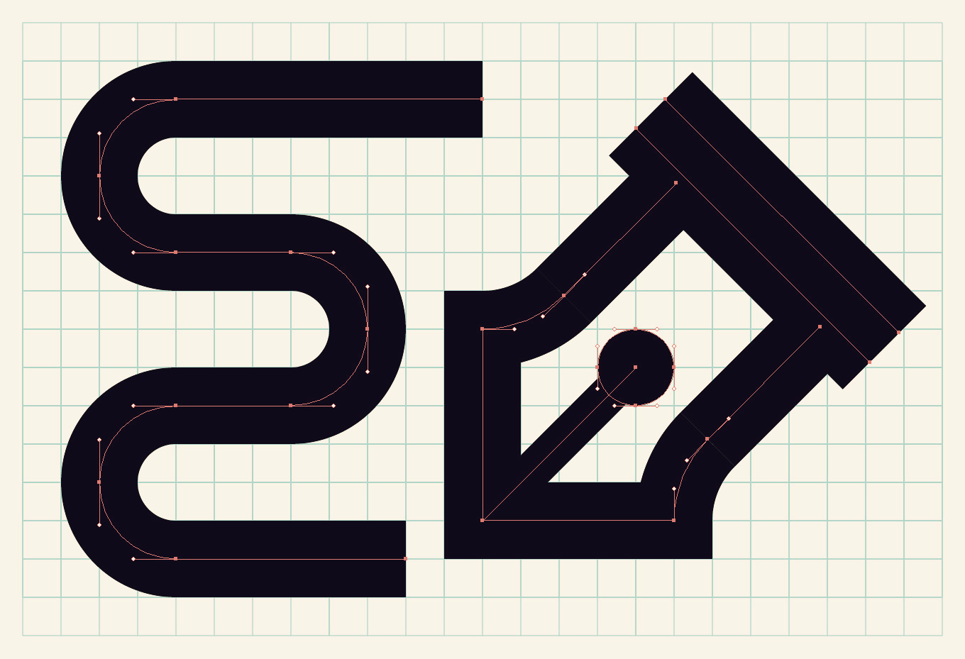
I drew this UNT monogram logo on a grid using an 18 point stroke weight and the line tools in Adobe Illustrator. The strokes were then outlined and some slices were added to create the appearance of overlapping.
Drawing with stroked vectors by using the line tools is the best method for creating single-line-weight letters and illustrations. One issue that arises from working this way is that the grid and stroked elements don’t often line up. The disparity comes from the differing default measurement systems between the grid, which is measured in inches, and strokes, which are measured in points. While the two measurement systems might appear to be unrelated, those in the know remember that 72 points equal one inch. With that fact in mind, and starting from the default grid in Illustrator (1 inch grid with 8 subdivisions), some quick math (8 x 9 = 72) will tell you that if you base your strokes off of the number 9, your strokes will align with the grid after being outlined. I have found that doubling the number of default subdivisions works even better with a 9 point stroke. Here’s why: the lines you will be drawing are going to be running along your grid. A 9 point stroke is equal to 1/8 of an inch (.125 in), but that means your stroke will be straddling the grid the same way the stroke straddles the vector line. It is equal to one unit, but the outlined stroke is not hitting the intersections of the grid. By doubling your subdivisions to 16, you will ensure that an outlined 9 point stroke will be hitting the grid on all sides. Don't forget to select Snap To Grid from the View menu when working this way.
This example illustrates why you either need to double your grid subdivisions or your stroke weight. Use the arc tool (hidden behind the line tool in Adobe Illustrator) to create quarter-circle arcs.
After doubling the grid subdivisions to 16, a 9 point stroke covers the width of two grid units. You could also keep the subdivisions at 8 and double the stroke weight to 18 for the same effect.
I created a guide to help anyone seeking to work this way. The chart below shows the relationship between the number of subdivisions in the grid and stroke weights. The numbers located at the intersections of these two values represents the number of grid units your stroke weight will cover. On the left half of the chart, the grid is divided by multiples of 8. Stroke weights that are multiples of 9 will snap with this grid. If you would prefer to use stroke weights in multiples or halves of 8, then use the chart on the right instead. You can flip the subdivisions and stroke weights depending on your preference. As long as one is in multiples of 8, and the other is in multiples of 9, your strokes and grid will flow together.
Click on the image above to get a better look, or download it as a PDF using the button below. You can print it out if you like!
It took me a while to understand all this math, but working this way has become much more intuitive after some practice. You shouldn't attempt to create geometric design with guesswork. Figure out the math, and your designs will be beautifully precise.

Moving Sale + New Poster
The story of our lives are often told in chapters. Milestones such as finishing high school, getting married, or starting a new job often mean closing one chapter and beginning a new one. For me, a new chapter is approaching when my wife Alisha, our three children, and I move to Denton, Texas in two weeks. I will be teaching Communication Design at the University of North Texas starting this fall. Though I have loved working at Mississippi State University for the past 5 years, I'm very excited about this new phase in our lives. As you probably know, moving is difficult. I will have to temporarily close my online store as we make this transition. To help lighten our load, I'm offering free shipping on all products for U.S. orders until Wednesday, July 2nd, when you use the code NOSHIP during checkout. Every item that you purchase is one less item that I have to move!
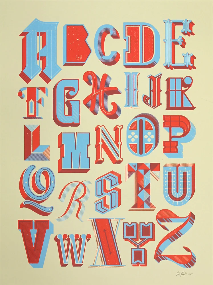
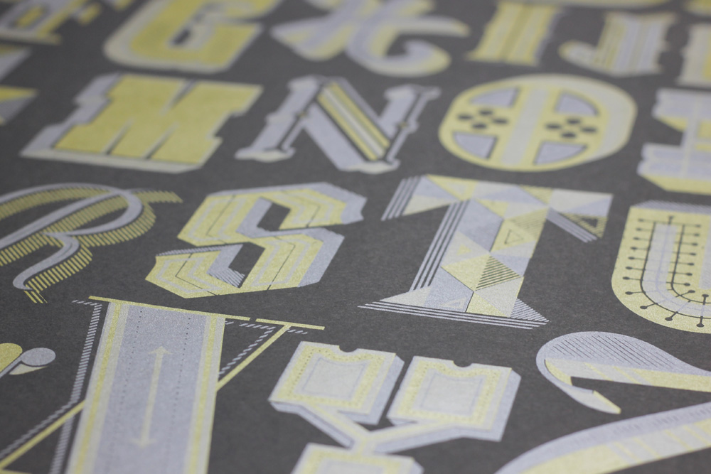
I recently completed a drop cap alphabet poster, and I created a comprehensive process video to show you how it was done. I want to give a big thank you to my friend and former student Andrew Le for providing the excellent soundtrack.

If you would like to pick up one of the prints, just head over to the store. Don't forget to use the code NOSHIP during checkout to receive free shipping to a U.S. address until July 2nd, 2014.
Maker's Summit Giveaway Winner
We have a winner! Kara Rodgerson, who runs the blog Mine For The Making, entered the Maker's Summit Giveaway with this tweet:
Congratulations Kara! If Kara can not attend the conference, I will choose another winner who will be able to attend. Thank you to everyone who entered.

Maker's Summit Ticket Giveaway
As a keynote speaker at this year's Maker's Summit in Greenville, South Carolina on March 1, I have a free ticket to the event. One lucky winner will receive an all-access pass to The Maker's Summit, both the conference and the after party. The Maker's Summit is a one-day business conference for the art, craft, and design world. The winner will have to provide his or her own travel and accommodations to the event.
To enter the giveaway, first follow me on twitter here. Once you have followed me (or if you already do), then please tweet a link to this blog post and be sure to include my twitter handle (@judelandry) and some words about why you want to win the ticket.
You must enter by the end of Wednesday, January 29 (CST). I will choose the winner at random and send you a link with the ability to register for the conference. The winner must register by February 1, 2014. Please do not enter the giveaway if you can not make it to the event. The ticket is not transferable.
Be sure to check out this video from last year's Maker's Summit. Good luck everyone!
Porter Flea Holiday Market
I'm pleased to announce that I'll be selling my original posters and t-shirts at the Porter Flea Holiday Market at Track 1 in Nashville this Friday, December 6th and Saturday, December 7th. The event will feature over 85 of the region’s best designers of modern handmade apparel and accessories, home goods, furniture, jewelry, and paper goods. Porter Flea is without a doubt the best handmade market I have ever seen. If you're in the Nashville area, please visit!
