
I recently started to build a font and I thought I'd share some process shots. My idea was to build a display typeface in two versions, one with a latin serif and a decorative variant with swashes. Davida, a decorative Art Nouveau font, is an obvious influence. It's one of my favorite guilty pleasure typefaces. I love bold condensed typefaces for display settings, and I wondered if I could create a condensed version of Davida. Each letter is drawn from scratch, or is being built out of a few modular pieces. The typeface then grew into this two weight idea, one with the swashes and one without. Below you will see the regular weight, though I haven't finished the K or W yet.
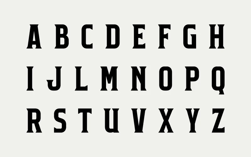
One of the problems I encountered was that when one condenses the letters, there is much less space for a ball in the counter space. I want to keep the balls in the counter as much as possible so tight spacing will still be possible. There are no plans for a lowercase at this point. I need to complete a few letters, the numbers, symbols, and then all the spacings. It's tedious but I enjoy seeing the results. The hardest part will be thinking of a satisfactory name for my font that has not already been used.
